Designing with Color: Supporting Neurodivergence in Learning Spaces
- Not all colors support focus and comfort. Some can create sensory stress:
- Overly Bright Primary Colors – Avoid using large expanses of bright red or yellow on walls or floors, as these can overstimulate. Instead, integrate small doses in signage, art or on an accent wall.
- High-Contrast Patterns – Flooring and soft seating with checkerboards, zigzags or other designs may cause visual confusion. Visual figure-ground is the brain’s ability to separate a main object (the figure) from its surroundings (the ground), allowing focus on relevant details in a busy visual field, such as finding a word on a page or a friend in a crowd. It is an integral part of perception, making sense of cluttered scenes by creating foreground and background. Busy furniture patterns, rugs, and floors make extra work for neurodiverse students that may struggle with figure ground perception. Choose carpets, furniture pieces and resilient flooring with subtle textures or low-contrast patterns.
- Excessive Red – A bright red corridor or entry wall may feel alarming. Consider soft terracotta tones or muted brick for warmth without intensity. Red is often a popular go to choice in gyms for its energetic effect, enhancing adrenaline and stamina—ideal for cardio and intense workouts. However, excessive red can cause aggression, so it is best balanced with neutral colors making it suitable for accent walls without overstimulation.
- Stark Black-and-White Schemes – Large expanses of high-contrast tile or wall graphics can be disorienting; instead, blend gradations of neutrals for balance.
- A recent study on the effects of color and light on students with autism highlighted some key findings:
- Color Preferences: The study found that children with autism typically favored neutral colors such as grey, green, blue, and white.
- Studies showed that vivid colors such as red and yellow negatively impacted them.
- Grey color has no effect, either positive or negative on those with ASD. It was discovered that using white colors by themselves had a negative impact.
- Of note, is the 2026 Pantone Color of the Year, Cloud Dancer. It is described as “a serene off-white neutral symbolizing calm and a fresh start.” It is the first white shade ever chosen by Pantone. For learning environments, research on white and gray colors should be a consideration when designing for neurodivergent students being mindful not to overuse white as a main color choice.
Color plays a powerful role in shaping how students experience their environment. For neurodivergent learners, who may process sensory input differently, the right color choices can make the difference between a supportive, calming classroom and one that feels overwhelming or distracting. As schools and architects work to create inclusive learning environments, it is worth understanding how intentional color design can meet the needs of all students.
Why Color Matters in Neurodivergent Spaces
Neurodivergent students—those with autism, ADHD, LD such as dyslexia, and other neurological differences—often have heightened sensitivities to their surroundings. Bright or overly saturated colors may overstimulate, while dull spaces can feel disengaging. The goal is balance: using color to guide focus, reduce stress, and support emotional regulation.
Principles of Color in Inclusive Learning Spaces
- Soothing, Muted Tones for Calm
Soft blues, greens, and earth tones can help regulate emotions, reduce anxiety, and create a sense of safety. These colors are especially effective in breakout rooms, sensory zones, or quiet study areas. - Strategic Pops of Color for Focus
Instead of large walls painted in intense hues, use color as accents in furniture, window treatments, or wayfinding graphics. Warm yellows or oranges can signal areas for collaboration without overwhelming the senses. - Neutral Foundations
A foundation of soft neutrals—grays, off-whites, or beiges—reduces visual clutter and provides a calming backdrop. Pair these tones with natural wood finishes or acoustic wall panels to ground the design. - Consistent Color Zoning
Architects can establish intuitive navigation by assigning assorted color palettes to distinct functions. For example:- Cool blues and greens in “cave” zones for reflection.
- Warm neutrals and soft yellows in “watering hole” zones for collaboration.
- Earth tones in “campfire” zones for group instruction.
Colors to Avoid in Neurodivergent-Friendly Spaces
Examples of the Built Environment
- Wall Finishes: Select low-sheen paints in muted tones rather than glossy finishes, which can reflect light and add to sensory overload.
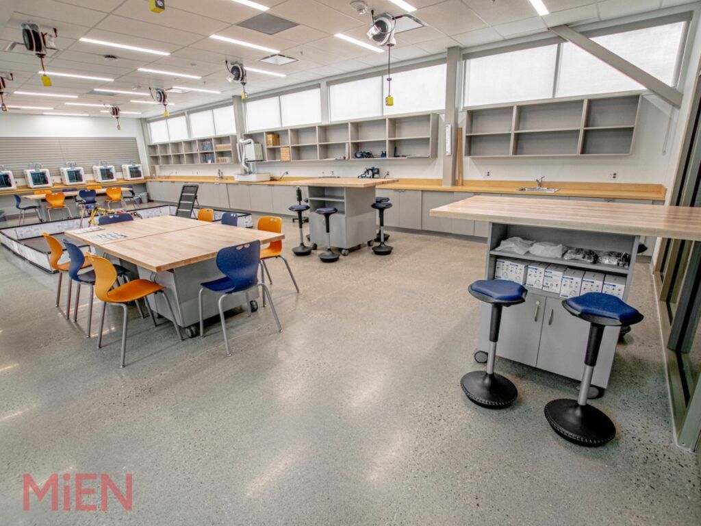
- Flooring: Research conducted that analyzed people’s responses to commercial flooring patterns and materials often found in offices, showed that some have negative effects especially for neurodivergent employees. Natural materials and forms such as wood typically contain lower levels of visual noise and are a better option as they are easier for the brain to process, making the space much easier to use and more enjoyable for everyone. Choose calming, continuous patterns. For example, a soft gray carpet tile with minimal variation rather than bold geometrics. Use solid color blocking only to support wayfinding.
- Ceilings: Consider using soft, cool tones on ceilings in classrooms to visually “lower” the space and make it feel less overwhelming. Strategic acoustic ceiling panels in the cooler/earth tones may further reduce visual and auditory overload and support self-regulation.
- Natural Light & Glazing: Pair daylighting strategies with colors that diffuse glare. Frosted glass paired with pale greens or blues softens the environment. High placed windows such as a clerestory design with remote blinds make an excellent choice to allow natural light to penetrate a space while limiting distractions caused by the view.
- Furniture & Casework: Incorporate natural wood tones or soft laminates instead of high-gloss, brightly colored plastics. In her book Designing Neuroinclusive Workplaces
author Kay Sargent states that “Natural materials are calming, refreshing and relaxing. Wood gives us a connection to nature, a sense of authenticity and an organic feel.” - Wayfinding & Signage: Apply color as a gentle guide. For example, use muted blue doors to indicate quiet rooms or warm yellow icons for collaboration hubs. As discussed above, avoid the use of patterned flooring and use solid color blocking for ease in navigation.
The Benefits of Color-Inclusive Design
It is not just about wall paint! As we have seen, color concepts can be applied across flooring, furniture, glazing and even ceilings to help with self-regulation that supports focus, attention, and a sense of wellbeing. When architects thoughtfully incorporate color for neurodivergent needs, the entire student community benefits. Educators are empowered with calmer classrooms that reduce or eliminate sensory triggers. Students experience environments that feel welcoming, manageable, and adaptable to their needs. Ultimately, color-inclusive design fosters equity—ensuring every learner has the opportunity to thrive in a sensory friendly environment.
References
Hussein, H.A. & Salim S.S. The Impact of Color on Student’s Perception in Learning Spaces Tigrit Journal of Engineering Sciences (2021).
Gaines, K. The Inclusive Classroom: The Effects of Color on Learning and Behavior, Journal of Family & Consumer Sciences. (2011).
Shareef, Sardar S. & Farivarsadri, Guita. The Impact of Color and Light on Children with Autism. International Journal of Arts and Technology (2018).
Sargent, K. Designing Neuroinclusive Workplaces: Advancing Sensory Processing and Cognitive Well-Being in the Built Environment New Jersey. Wiley &Sons 2025.